Rails Bootstrap Form Extensions
Table of Contents
- Requirements
- Dependencies
- Installation
- SubmitBar
- Duration
- Timespan
- ArrayedField
- Scheduler
- Date and Time Pickers
- SelectOrNew
- Contributing
Requirements
- Ruby 2.0+
- Rails 4.0+
- Twitter Bootstrap 3.0+
Dependencies
This gem will install the following gems/libraries:
- Rails Bootstrap Forms, ~> 2.3
- Bootstrap Datepicker for Rails, ~> 1.4
- bootstrap-datepicker, 1.5.0
- Bootstrap Timepicker, 0.5.0
- $.html5data, 1.0
Installation
Add it to your Gemfile:
gem 'bootstrap_form_extensions'Then:
bundle
Then require the JS in your application.js file:
/*
 *= require bootstrap_form_extensions
 */
And require the CSS in your application.css file:
/*
 *= require bootstrap_form_extensions
 */
SubmitBar
Using all the default arguments, doing this:
<%= f.submit_bar %>generates a form group, with two buttons: Save (a dropdown menu, that includes 'Save and duplicate', and 'Save and new' options), and Cancel:
<div class="form-group col-sm-12">
  <div class='pull-left submitbar-left'>
    <div class="btn-group dropup submitbar-submit-group">
      <button type="submit" class="btn btn-primary submitbar-save">Save</button>
      <button type="button" class="btn btn-primary dropdown-toggle submitbar-next-action-toggle" data-toggle="dropdown">
        <span class="caret"></span>
        <span class="sr-only">Toggle Dropdown</span>
      </button>
      <ul class="dropdown-menu submitbar-next-action-menu" role="menu">
        <li><button type="submit" name="next_action" class="btn-link submitbar-duplicate" value="duplicate">Save and duplicate</button></li>
        <li><button type="submit" name="next_action" class="btn-link submitbar-new" value="new">Save and new</button></li>
      </ul>
    </div>
    <a class="btn btn-default submitbar-cancel" rel="nofollow" href="/things">Cancel</a>
  </div>
</div>
Configuration
The following arguments can be used to configure the submit bar:
| Argument | Description | Default |
|---|---|---|
| show_submit_button | Show the Save button | true |
| submit_button_text | Text used in the save button | 'Save' |
| show_submit_menu | Show the dropdown menu on the save button | true |
| show_submit_and_dup_button | Show a 'Save and duplicate' option in the dropdown submit menu. The 'Save' text is affected by the submit_button_text argument | true |
| show_submit_and_new_button | Show a 'Save and new' option in the dropdown submit menu. The 'Save' text is affected by the submit_button_text argument | true |
| show_cancel_button | Show the Cancel button | true |
| cancel_button_text | Text used in the cancel button | 'Cancel' |
| cancel_button_url | URL used in the cancel button | If the form object is a persisted ActiveRecord instance, the url to the show action; if not, the index action. If none of these path exit, then it uses 'javascript:history.back();' |
| extra_buttons | An array of hashes with the definition of the extra buttons to be added between the submit and cancel buttons. The options should include at least :text and :url for the button. Anything else is passed as html options to the button | [] |
| right_buttons | An array of hashes with the definition of the extra buttons to be added on the right side of the submit bar. The options should include at least :text and :url for the button. Anything else is passed as html options to the button | [] |
| partial | Partial template used to render the submit bar | See Default partial below for details |
You can also change the default of partial, show_submit_button, submit_button_text, show_submit_menu, show_submit_and_dup_button, show_submit_and_new_button, show_cancel_button, cancel_button_text, or back_button_text, by invoking them on the BootstrapFormExtensions::SubmitBar, for example in an initializer file, like this:
BootstrapFormExtensions::SubmitBar.partial = 'layouts/form_footer'
BootstrapFormExtensions::SubmitBar.show_submit_menu = false
Default partial
This is the actual code of the default partial (located in app/views/bootstrap_form_extensions/_submit_bar.html.erb):
<div class="form-group">
  <div class='pull-left submitbar-left'>
    <% if show_submit_button %>
      <div class="btn-group dropup submitbar-submit-group">
        <button type="submit" class="btn btn-primary submitbar-save"><%= submit_button_text %></button>
        <% if show_submit_menu %>
          <button type="button" class="btn btn-primary dropdown-toggle submitbar-next-action-toggle" data-toggle="dropdown">
            <span class="caret"></span>
            <span class="sr-only">Toggle Dropdown</span>
          </button>
          <ul class="dropdown-menu submitbar-next-action-menu" role="menu">
            <% if show_submit_and_dup_button %>
              <li><button type="submit" name="next_action" class="btn-link submitbar-duplicate" value="duplicate"><%= submit_button_text %> and duplicate</button></li>
            <% end %>
            <% if show_submit_and_new_button %>
              <li><button type="submit" name="next_action" class="btn-link submitbar-new" value="new"><%= submit_button_text %> and new</button></li>
            <% end %>
          </ul>
        <% end %>
      </div>
    <% end %>
    <% extra_buttons.each do |text:, url:, options:| %>
      <%= link_to text, url, options %>
    <% end %>
    <% if show_cancel_button %>
      <%= link_to cancel_button_text, cancel_button_url, class: "btn btn-default submitbar-cancel", rel: "nofollow" %>
    <% end %>
  </div>
  <% if right_buttons.any? %>
    <div class='pull-right submitbar-right'>
      <% right_buttons.each do |text:, url:, options:| %>
        <%= link_to text, url, options %>
      <% end %>
    </div>
  <% end %>
</div>
You can use it as a template to create your own partial(s).
Duration
Having, for example, a column duration_in_seconds (a float column, to handle milliseconds), doing this:
<%= f.duration :duration_in_seconds %>generates this html:
<div class="form-group duration-group" data-duration="true">
  <label class="control-label col-sm-2" for="thing_duration_in_seconds">Duration in seconds</label>
  <div class="col-sm-10 form-inline">
    <input class="duration-seconds" id="thing_duration_in_seconds" name="thing[duration_in_seconds]" type="hidden" value="0.000">
    <input class="form-control hours" id="thing_hours" min="0" name="thing[hours]" type="number" value="0">
    :
    <input class="form-control minutes" id="thing_minutes" max="59" min="0" name="thing[minutes]" type="number" value="0">
    :
    <input class="form-control seconds" id="thing_seconds" max="59" min="0" name="thing[seconds]" type="number" value="0">
    .
    <input class="form-control milliseconds" id="thing_milliseconds" max="999" min="0" name="thing[milliseconds]" type="number" value="0">
  </div>
</div>
It accepts any option you'd pass to a form_group.
Duration without bootstrap
There is a version of this control that doesn't apply all bootstrap styling:
<%= f.duration_without_bootstrap :duration_in_seconds %>generates this html:
<div class="duration-group" data-duration="true">
  <input class="duration-seconds" id="thing_duration_in_seconds" name="thing[duration_in_seconds]" type="hidden" value="0">
  <input class="hours" id="thing_hours" min="0" name="thing[hours]" type="number" value="0">
  :
  <input class="minutes" id="thing_minutes" max="59" min="0" name="thing[minutes]" type="number" value="0">
  :
  <input class="seconds" id="thing_seconds" max="59" min="0" name="thing[seconds]" type="number" value="0">
  .
  <input class="milliseconds" id="thing_milliseconds" max="999" min="0" name="thing[milliseconds]" type="number" value="0">
</div>
If you still want to use the bootstrap styling, but not the form formatting (for instance, when you need to include this control in an inline form, or inside another element), you can customize like this:
<%= f.duration_without_bootstrap :duration_in_seconds, class: 'form-control', wrapper_class: 'form-inline' %>Timespan
Having, for example, a column duration_in_seconds, doing this:
<%= f.timespan :duration_in_seconds %>generates this html:
<span data-timespan="true">
<input class="timespan-seconds" type="hidden" value="3600" name="thing[duration_in_seconds]" id="thing_duration_in_seconds" />
<div class="form-group">
<input type="text" name="duration_quantity" id="duration_quantity" value="1" size="5" class="form-control timespan-quantity" />
</div>
<div class="form-group">
<select name="duration_unit" id="duration_unit" class="form-control timespan-unit">
<option selected="selected" value="1">seconds</option>
<option value="60">minutes</option>
<option value="3600">hours</option>
<option value="86400">days</option>
<option value="604800">weeks</option>
<option value="18144000">months</option>
</select>
</div>
</span>Configuration
The following arguments can be used to configure the timespan:
| Argument | Description | Default |
|---|---|---|
| units | The list of units that will be displayed | [ :seconds, :minutes, :hours, :days, :weeks, :months ] |
| quantity_options | html options to be added to the quantity input | {} |
| unit_options | html options to be added to the unit select | {} |
You can also change the default of units by invoking it on the BootstrapFormExtensions::Timespan, for example in an initializer file, like this:
BootstrapFormExtensions::Timespan.units = [ :hours, :days ]ArrayedField
ArrayedField provides three helpers:
arrayed_text_field
Given a column that holds an array of texts, this helper adds a multiple line text inputs:
<%= f.arrayed_text_field :lists %>It accepts any option you'd pass to a form_group. If the column provided doesn't exist, or is not an array, it assumes an empty array as the value.
arrayed_url_field
Given a column that holds an array of URLs, this helper adds a multiple line url inputs:
<%= f.arrayed_url_field :urls %>It accepts any option you'd pass to a form_group. If the column provided doesn't exist, or is not an array, it assumes an empty array as the value.
arrayed_json_field
Given a column that holds an array of hashes, this helper adds a multiple line, multiple field, text/select inputs:
<%= f.arrayed_json_field :variables, [ :name, :value ] %>The generated html contains multiple lines like this:
<div class="col-sm-2">
  <input type="text" name="thing[variables][][name]" class="form-control" placeholder="name" />
</div>
<div class="col-sm-2">
  <input type="text" name="thing[variables][][value]" class="form-control" placeholder="value" />
</div>
The list of fields in the hash can be customized further:
<%= f.arrayed_json_field :variables, [ { name: { type: :select, options: [ [ "One", "var1" ], [ "Two", "var2" ] ] } }, :value ] %>type can be :text or :select.
The generated html for each element of the array would look something like this:
<div class="col-sm-2">
  <select class="form-control">
    <option value="var1">One</option>
    <option value="var2">Two</option>
  </select>
</div>
<div class="col-sm-2">
  <input class="form-control" name="thing[variables][][value]" placeholder="value" type="text">
</div>
It accepts any option you'd pass to a form_group. If the column provided doesn't exist, or is not an array, it assumes an empty array as the value.
Scheduler
This widget creates a grid of days and hours to choose a schedule. Called like this:
<%= f.scheduler :schedule %>generates this:
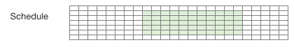
This grid reflects the schedule selected. Clicking on the grid brings up the schedule editor:
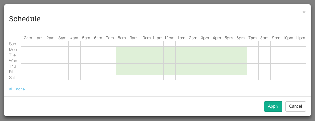
The days and hours headers are clickable, as well as each cell, to allow any custom selection.
scheduler accepts the same arguments than bootstrap form's form_group: a method for the value, and options for the form group.
Model
This control expects the attribute to be serialized like this:
# Migration:

class AddSchedulerField < ActiveRecord::Migration
  def change
    add_column :things, :schedule, :text
  end
end

# Model

class Thing < ActiveRecord::Base
  ...
  serialize :schedule, BootstrapFormExtensions::Scheduler.serializer
  ...
end
This will serialize the column to yaml. If you're using an array column (e.g. PostgreSQL), you could do:
# Migration:

class AddSchedulerField < ActiveRecord::Migration
  def change
    add_column :things, :schedule, :text, array: true, default: []
  end
end

# Model

class Thing < ActiveRecord::Base
  ...
  serialize :schedule, BootstrapFormExtensions::Scheduler.serializer to: :array
  ...
end
Default selection
Each hour in the schedule grid is selected by default:
> thing = Thing.new schedule: []
> thing.schedule
=> [[true, true, true, true, true, true, true, true, true, true, true, true, true, true, true, true, true, true, true, true, true, true, true, true], ...]
You can change this default in the model:
class Thing < ActiveRecord::Base
  ...
  serialize :schedule, BootstrapFormExtensions::Scheduler.serializer default_selection: false
  ...
end
This would result in:
> thing = Thing.new schedule: []
> thing.schedule
=> [[false, false, false, false, false, false, false, false, false, false, false, false, false, false, false, false, false, false, false, false, false, false, false, false], ...]
Date and Time Pickers
DatePicker
This helper is a wrapper for the bootstrap-datepicker gem. Using all the default arguments, doing this:
<%= f.date_picker :start_date %>generates this html:
<div class="form-group">
  <label class="control-label col-sm-2" for="thing_start_date">Start date</label>
  <div class="col-sm-10">
    <div class="input-group date" data-date-autoclose="true" data-date-disable-touch-keyboard="true" data-date-enable-on-readonly="false" data-date-format="yyyy-mm-dd" data-date-show-on-focus="false" data-date-today-btn="linked" data-date-today-highlight="true" data-provide="datepicker">
      <input class="form-control" id="thing_start_date" name="thing[start_date]" size="10" type="text" value="1971-10-21">
      <span class="input-group-addon"><i class="glyphicon glyphicon-calendar"></i></span>
    </div>
  </div>
</div>
It accepts any option you'd pass to a form_group. You can also pass any options to the bootstrap-datepicker gem, like this:
<%= f.date_picker :start_date, widget: { clear_btn: true } %>This helper sets these bootstrap-datepicker's defaults (you can overwrite these too, in the same way shown above):
| Option | Default |
|---|---|
| today_highlight | true |
| format | 'yyyy-mm-dd' |
| today_btn | 'linked' |
| autoclose | true |
| disable_touch_keyboard | true |
| enable_on_readonly | false |
| show_on_focus | false |
Check bootstrap-datepicker's documentation for more details on these and other available options.
TimePicker
This helper is a wrapper for the Bootstrap Timepicker library. Using all the default arguments, doing this:
<%= f.time_picker :start_time %>generates this html:
<div class="form-group">
  <label class="control-label col-sm-2" for="thing_start_time">Start time</label>
  <div class="col-sm-10">
    <div class="input-group bootstrap-timepicker">
      <input class="form-control" data-provide="timepicker" id="thing_start_time" name="thing[start_time]" size="8" type="text" value="07:30:00">
      <span class="input-group-addon"><i class="glyphicon glyphicon-time"></i></span>
    </div>
  </div>
</div>
It accepts any option you'd pass to a form_group. You can also pass any options to the Bootstrap Timepicker library like this:
<%= f.time_picker :start_time, widget: { disable_mousewheel: true } %>This helper sets these bootstrap-datepicker's defaults (you can overwrite these too, in the same way shown above):
| Option | Default |
|---|---|
| minute_step | 1 |
| show_seconds | true |
| second_step | 1 |
| show_meridian | false |
| default_time | false |
Check Bootstrap Timepicker's documentation for more details on these and other available options.
DateTimePicker
This helper puts the DatePicker and TimePicker together for a DateTime field. Using all the default arguments, doing this:
<%= f.date_time_picker :start_at %>generates this html:
<div class="form-group">
<label class="control-label col-sm-2" for="thing_start_at">Start at</label>
<div class="col-sm-10 form-inline">
<div class="form-group">
<div class="input-group date" data-date-autoclose="true" data-date-disable-touch-keyboard="true" data-date-enable-on-readonly="false" data-date-format="yyyy-mm-dd" data-date-show-on-focus="false" data-date-today-btn="linked" data-date-today-highlight="true" data-provide="datepicker">
<input class="form-control" id="thing_start_date" name="thing[start_date]" size="10" type="text" value="1971-10-21">
<span class="input-group-addon"><i class="glyphicon glyphicon-calendar"></i></span>
</div>
</div>
<div class="form-group">
<div class="input-group bootstrap-timepicker">
<input class="form-control" data-provide="timepicker" id="thing_start_time" name="thing[start_time]" size="8" type="text" value="07:30:00">
<span class="input-group-addon"><i class="glyphicon glyphicon-time"></i></span>
</div>
</div>
</div>
</div>The helper assumes the existance of virtual attributes for the data and time, following the naming convention used by the Date Time Attributes gem. You can specify the names of the virtual attributes like this:
<%= f.date_time_picker :start_at, date_method: :start_at_date, time_method: :start_at_time %>You can pass options to each control, date and time, like this:
<%= date_time_picker :start_at, date_options: { widget: { clear_btn: true } }, time_options: { widget: { disable_mousewheel: true } } %>SelectOrNew
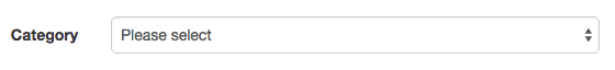
This helpers creates a select tag with an extra "New..." option at the end, that allows the user to input a new item. For instance:
<%= f.select_or_new :category, [ [ 'One', 1 ], [ 'Two', 2 ] ] %>generates this html:
<div class="form-group" data-select-or-new="true">
  <label class="control-label col-sm-2" for="thing_category">Category</label>
  <div class="col-sm-10">
    <select class="form-control" id="thing_category" name="thing[category]">
      <option value="">Please select</option>
      <option value="1">One</option>
      <option value="2">Two</option>
      <option value="0">New...</option>
    </select>
    <div class="input-group" style="display: none;">
      <input class="form-control" id="thing_new_category" name="thing[new_category]" placeholder="New..." type="text">
      <div class="input-group-addon select-or-new-cancel">
        <i class="text-danger glyphicon glyphicon-remove"></i>
      </div>
    </div>
  </div>
</div>
Initially, the control looks like a regular select tag:
When "New..." is selected, it turns to:
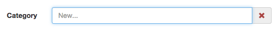
To go back to the select (canceling the new input), click on the cancel button (the red X).
The helper accepts the same parameters as Rails' select helper, plus any option you'd pass to a form_group.
If any of the choices you provided is selected, the appropriate value will be set in the filed (category_id, in the previous example). If "New..." is selected, the id will be set to '0', and a field called "new__field_" will be added (in the previous example that would be: category_id = '0', new_category = 'New Category').
Handling the new value
You could have something like this in the controller:
class ThingsController < ApplicationController

  ...

  def create
    @thing = Thing.build thing_params
    @thing.save_with_category
    respond_with @thing
  end

  def update
    @thing = Thing.find(params[:id])
    @thing.assign_attributes thing_params
    @thing.save_with_category
    respond_with @thing
  end

  private

  def thing_params
    params.require(:thing).permit :name, :category_id, :new_category
  end

  ...

end
And then in the model:
class Thing < ActiveRecord::Base

  belongs_to :category

  validates :name, :category_id, presence: true
  validate :new_category_presence

  attr_accessor :new_category

  def save_with_category
    return false unless valid?
    transaction { add_category_if_new && save }
  end

  private

  def add_category_if_new
    return true unless category_id == 0

    category = Category.build name: new_category
    if category.save
      self.category, self.new_category = category, ''
      return true
    end

    errors.add :category_id, category.errors.full_messages
    return false
  end

  def new_category_presence
    return true unless category_id == 0

    if new_category.blank?
      errors.add :category_id, "can't be blank"
      return false
    end
  end

end
Contributing
Here's a quick guide for contributing:
Fork the repo.
Run the existing test suite:
$ bundle exec rake -f test/dummy/Rakefile db:create db:migrate RAILS_ENV=test
$ bundle exec rake
$ bundle exec rake jasmine:ci
Add tests for your change.
Add your changes and make your test(s) pass.
Update the README if necessary.
Add a line to the CHANGELOG for your bug fix or feature.
Push to your fork and submit a pull request.